
Coolhouse Labs
Coolhouse Labs, “Summer Camp for Startups.”
Was a three month startup accelerator in Northern Michigan.
At Coolhouse, I was the lead designer on the in-house product team providing four early stage startups with design resources, from branding to product design, as well as presentation aid for the Coolhouse Demo Day in Ann Arbor, Michigan.
The Big Overhaul

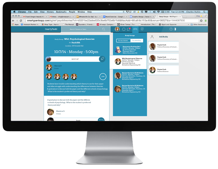
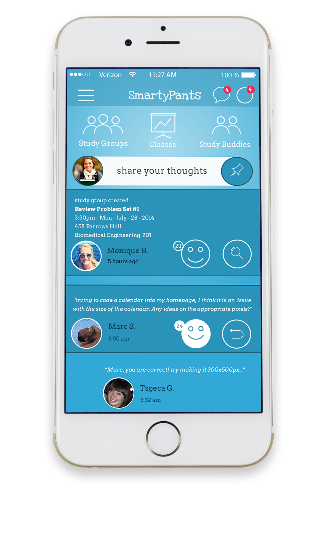
Fletch arrived at Coolhouse as a brand called Smarty Pants, which had discovered that the main threat against college retention is a lack of social belonging and peer interaction, leading to discouragement and eventually drop out.
They sought to address this issue by giving students a social platform, focused on creating quick study groups with peers from their classes whom they may not otherwise meet.
Rebrand
Although the name Smarty Pants was well received by college administrators, it alienated the end-user; young college students seeking belonging and peer help.
With this in mind we aimed to create something that felt more akin to a social platform rather than just another tool pushed on students by administrators. Having a handful of University of Michigan students working at Coolhouse gave us a great control group to brainstorm with and test concepts.
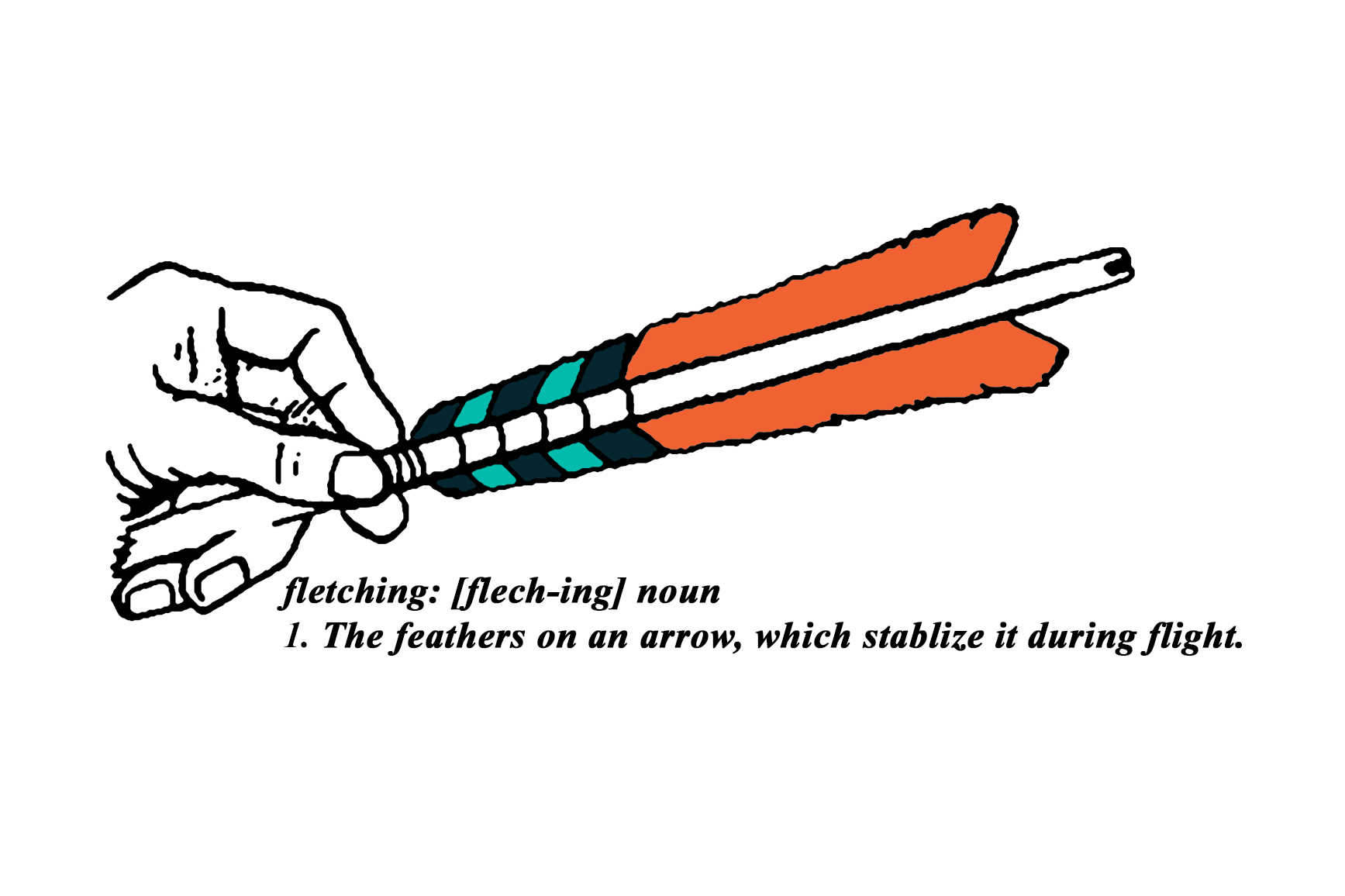
The main focus of the naming process was to choose something short and fresh while lending itself to a bold brand presence. With those requirements in mind, we wiped name after name off of our white board before arriving at Fletch.
A fletching is the tail feather of an archery arrow, which guides and stabilizes the arrow during flight. We thought this was the appropriate direction for a product that is intended to keep college students engaged and on target.
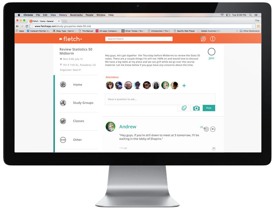
The Product
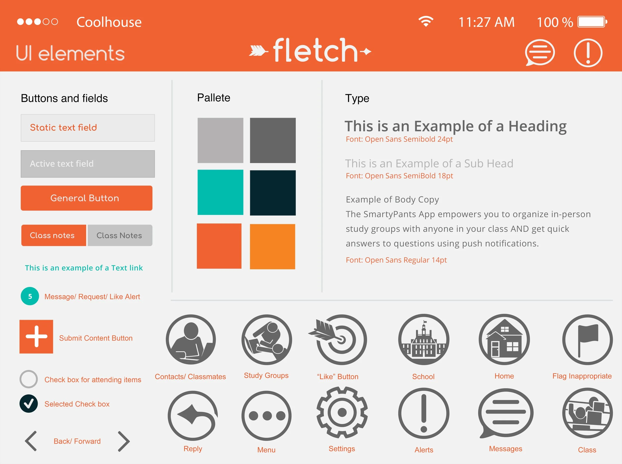
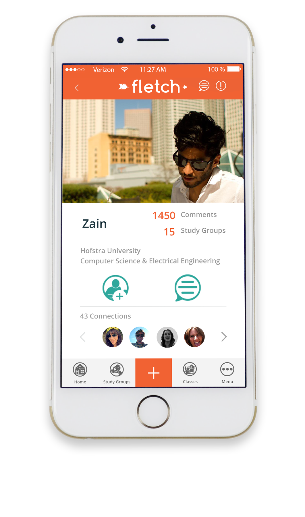
We also chose to replace the soft blues and fuchsia of the Smarty Pants brand with warm orange, teal, and a navy shade for contrast.
These colors were chosen to help move the brand away from a calm,
almost medical appearance, to a more exciting and engaging look.
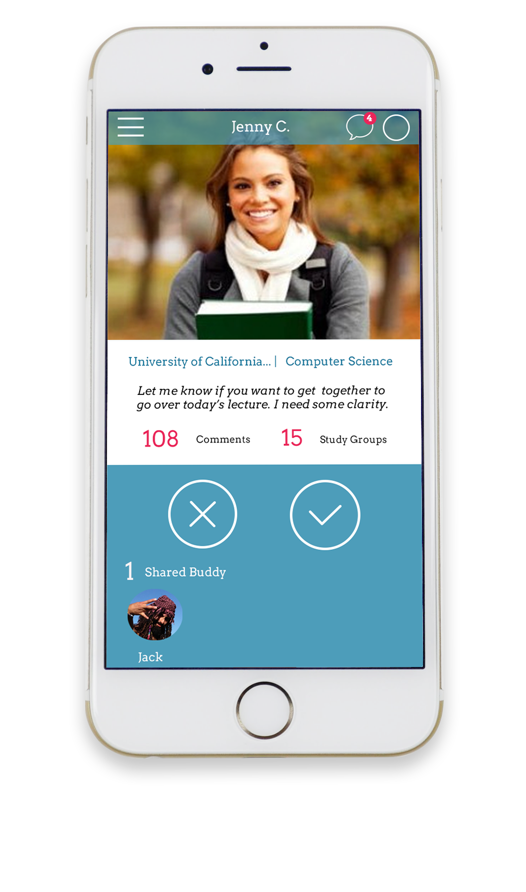
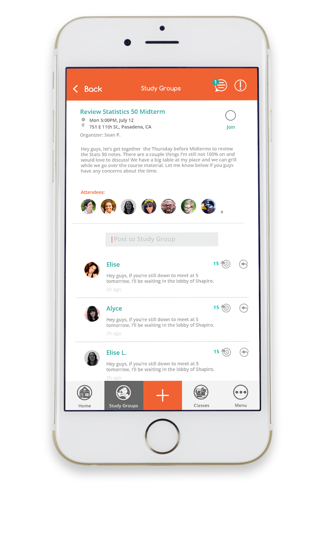
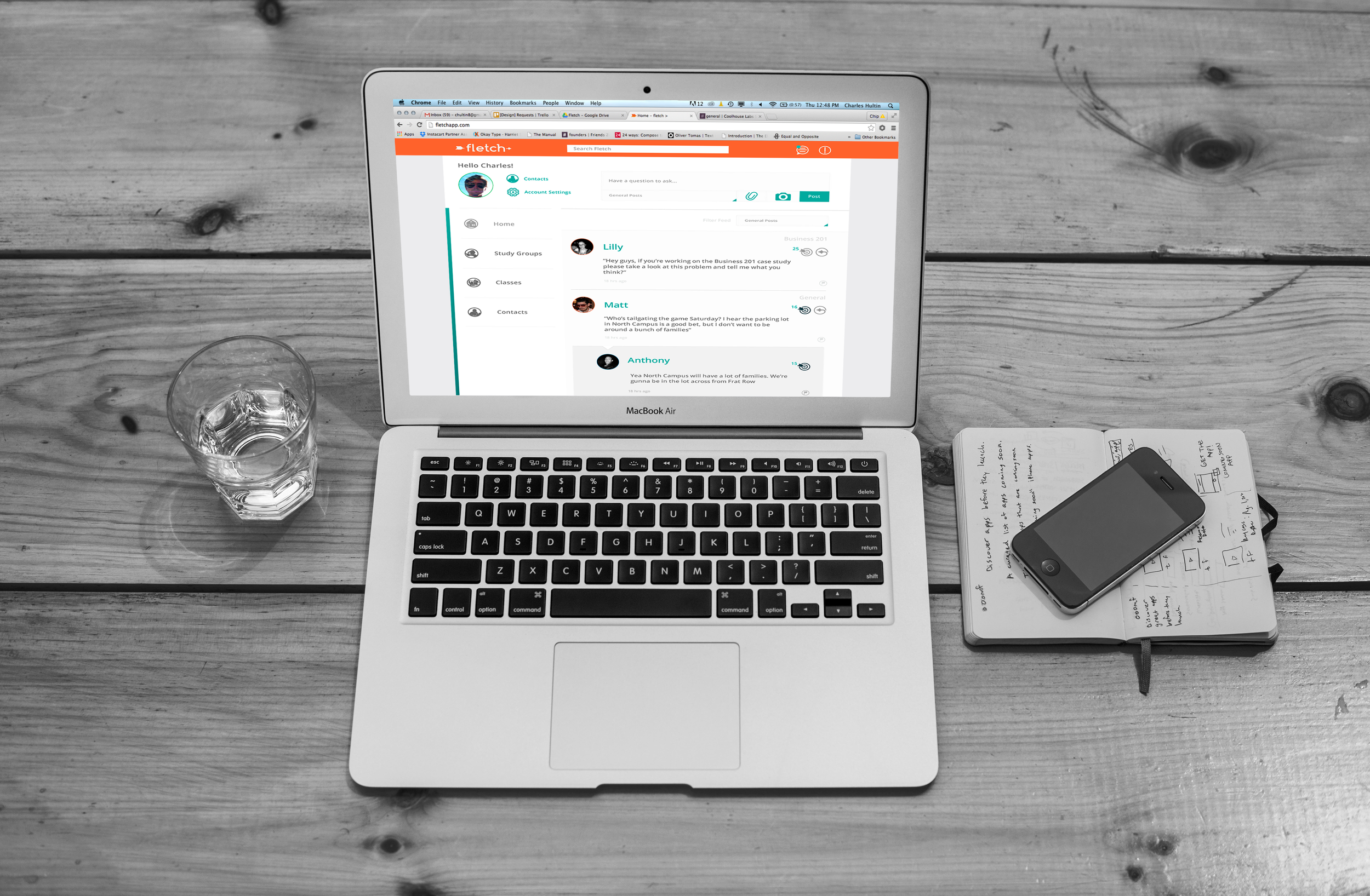
The rebrand included an overhaul of the app design for both web and mobile platforms.
For this step, we went through the app and added/dropped pages to help clear up the congested onboarding process, as well as adding filters and a search function to allow easier navigation throughout the platforms.
My Role
As the design lead on this project, I was involved every step of the creative process as outlined above. This began by meeting with Marquett Burton (Fletch CEO) to better understand the company’s mission and his vision for achieving it.
For the branding step, I was responsible for creating the new logo, introducing the new colorway, and working closely with our in-house UX designer Elise, to create the updated web and mobile designs. During the app re-design, I also established a custom icon set to further promote the new branding.
Although Elise and I worked closely with Marquett throughout the re-brand, we also communicated frequently with Fletch’s CTO Aditya, to ensure that the mobile and web designs were implemented as we envisioned. Working so closely with the client allowed us to be sure that the new brand was consistent across applications from mobile and web down to print and presentation materials.
Client Response
“Chip is one of the rare creative types who is able to understand how design, UI/UX, brand identity and business development must work in concert to achieve the greater mission of a company. He has taken my company, Fletch, to the next level with our mobile app design, a new logo, copy and a user experience that woos the pickiest users (college students). Chip learns your business and helps develop a solution that makes sense for your unique situation.”
-Marquett Burton, Fletch CEO